Statistics has two main goals:
- To describe and summarize data.
- To make inferences about a population based upon a sample.
In this article I want to address the first. In particular I will focus on two specific summary measures: the mean and median.
The Mean
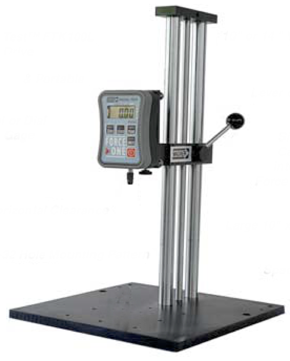
Pressure algometer
Statistics can be used to boil down a large amount of data to a few numbers that summarize the data. Perhaps the most common way of summarizing data is by taking an average. Take a look at the dataset presented in the table below. It consists of pain threshold data from 10 participants. In this study, participants placed their hands under a device called a pressure algometer (see picture). Pressure is applied to the finger and participants press a button when they reach the point where the pressure begins to be painful. That point is called the pain threshold. Three such pain tests (trials) are given and the threshold pressure for each is recorded.
The table presents the threshold data for 10 participants. What are we to make of these data? It is 30 numbers (3 thresholds for 10 participants). Do we really need all 30 numbers? For most purposes, no.

Three trials were taken because any given trial might result in an unusually high or low pain threshold. The pressure pad might just have caught a person’s finger in such a way that made it especially painful (resulting in a lower threshold) or an individual might have become distracted by some thought resulting in lower sensitivity (and a higher threshold). Therefore multiple trials were taken to account for these random events. But what we want is a single number for threshold. The mean (the technically more correct term for average) is a very common way to summarize many values into a single score. The mean threshold values for each of the 10 participants is presented in the right-hand most column in the table. With the mean, for all intents and purposes, the other numbers can be ignored. And now we’ve reduced our data load from 30 to 10!
 The figure at the left depicts the data for case #1. Each of the 3 pain thresholds is plotted as a separate blue dot and the mean is indicated by the green square. As you can see the mean is fairly representative of the “middle”.
But the mean may not always be so representative. It can be very susceptible to outliers, which are values that differ considerably from most of the other numbers in a dataset. Take a look at the figure below, depicting data from case #10.
 In this figure you can see that the green square, representing the mean of 38.6, is above the middle data point, 32.0. In this case the mean is being “pulled” up by the 60.2 value. Is this mean representative of the 3 data points? In such cases the mean becomes more difficult to interpret if used alone and its use as a summary statistic less reliable.
 To see an even stronger example, take a look at the Graph at the left, in which the means of all 10 cases are plotted. In this graph, the green square represents the mean of all the data; the purple triangle represents the mean of the data with the two outliers removed. The two outliers “pulls” the mean up. Is the full data mean a good summary of all 10 means? The best answer is that as useful as it is, we should only expect so much from it. You are advised to use the mean because it’s very useful as a summary but to also realize its weaknesses and take those into account in your interpretations of your data.
The Median
The median is commonly used summary statistic. It is the middle number among a list that has been sorted from lowest to highest. In the table below I have sorted the 10 mean threshold figures from the above dataset from lowest to highest:

As the median is simply the middle number within a sequence, it is not susceptible to outliers. Instead of 129.3 and 138.7, the last two mean threshold values could have been 10,000 and 1,000,000, and the median would remain unchanged at 39.0. You can see easily see the relationship between mean and median on the normal curve in the figure below. Because of the two outliers, the mean has shifted to the right of the median.

So that’s the dirt on mean and median summary statistics.
